Context
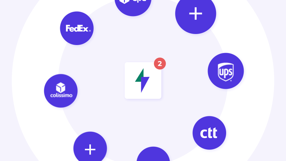
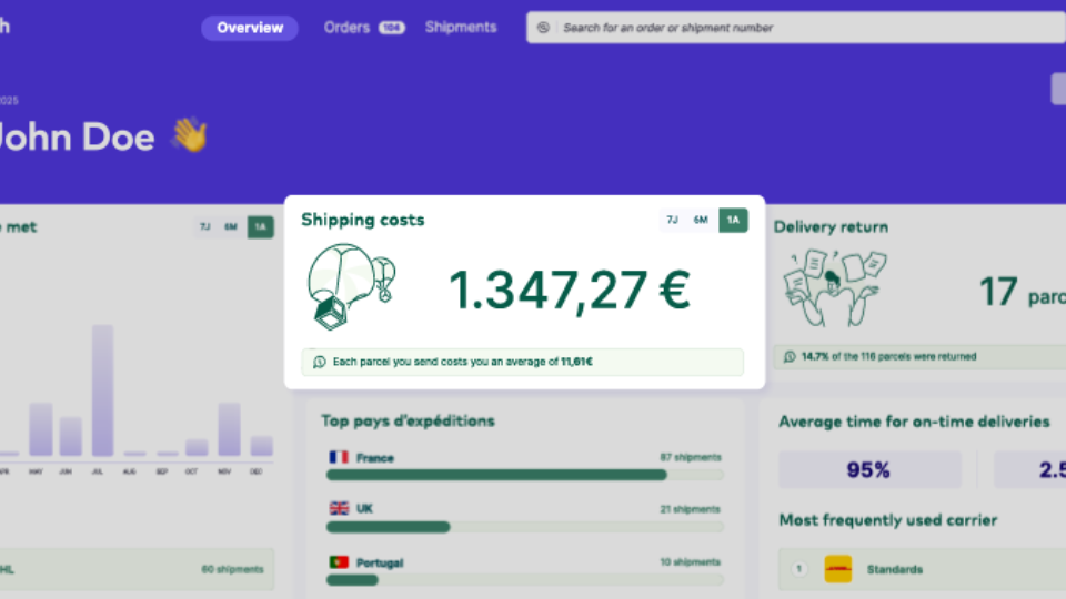
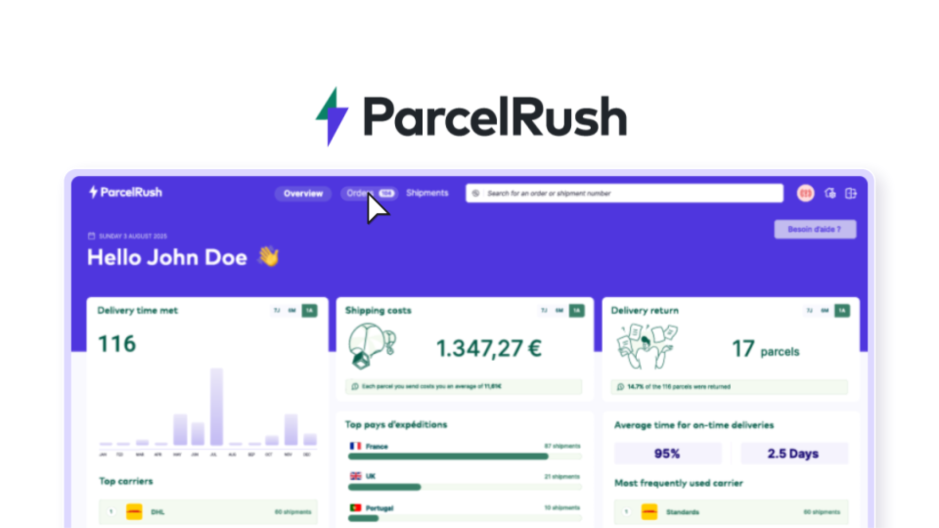
Parcel Rush is a new platform entering the European market in late 2025, built to simplify e-commerce shipping. The platform allows online sellers to manage every stage of their logistics: comparing rates, automating repetitive tasks, and tracking parcels with ease. In a competitive landscape where many solutions appear complex or overloaded, Parcel Rush positions itself differently by emphasizing clarity, efficiency, and user-friendly design. The goal is to communicate these values through both the product experience and its visual identity.
Approach
The creative direction focuses on delivering a minimal yet dynamic aesthetic that reflects Parcel Rush’s spirit: practical, positive, and forward-looking.
Two design routes were explored:
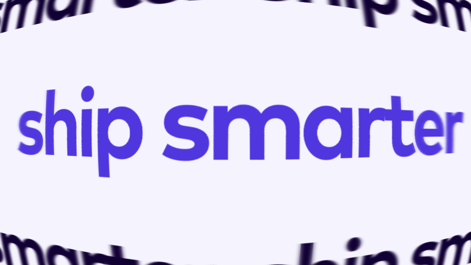
1, Kinetic Typography: highlighting simplicity and boldness, closely aligned with the brand’s promise of efficiency.
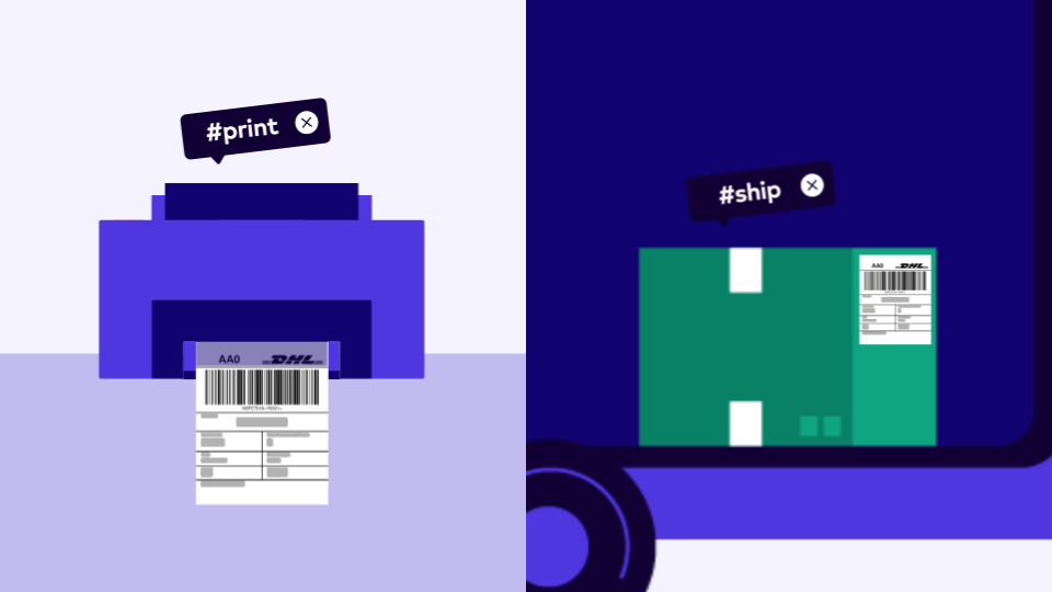
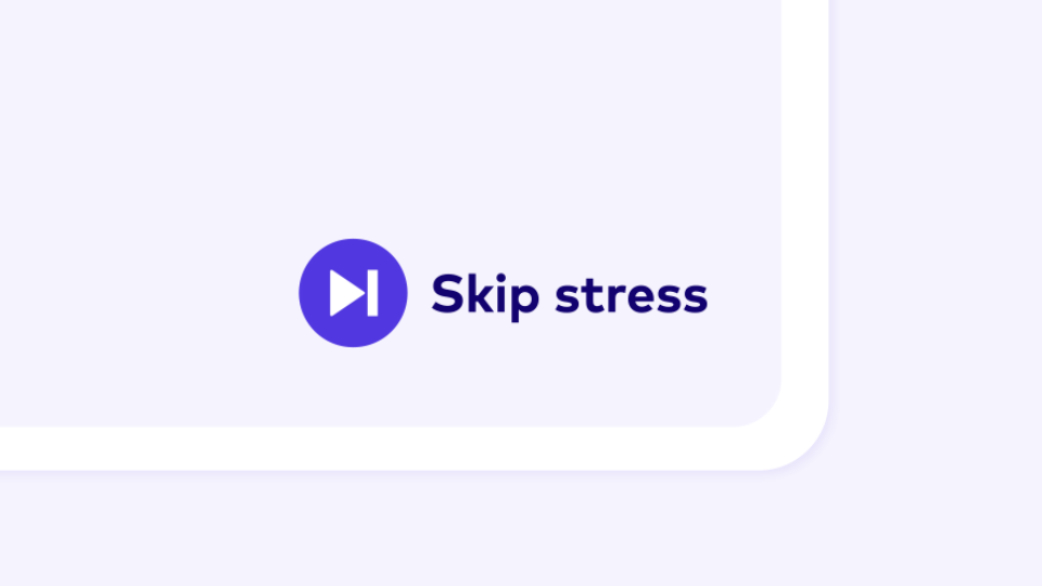
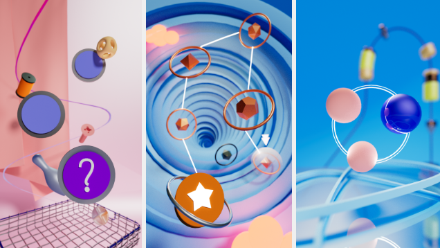
2, Illustration-driven visuals: approachable and memorable, designed to create emotional connection and stronger recall.
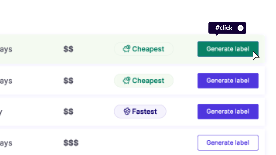
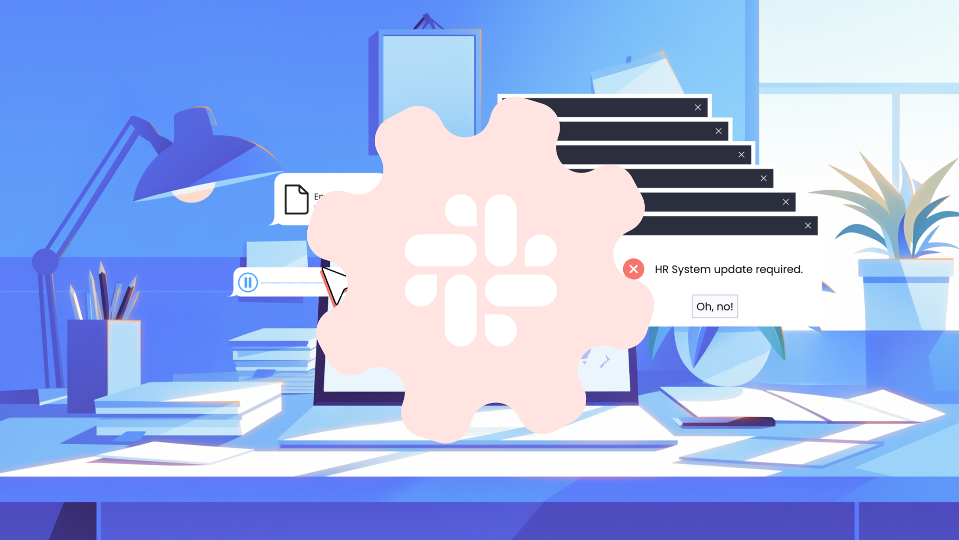
Regardless of the chosen route, UI motion plays a central role demonstrating core features, smooth user flows and the overall functionality of the platform. The color palette of blue, purple and white strengthens brand recognition and sets Parcel Rush apart within the e-commerce shipping space.
WATCH THE VIDEO
Sound is OFF by default - Turn it on for the full vibe!
Sound is OFF by default - Turn it on for the full vibe!
1. VERSION - kinetic typography
2. VERSION - illustration
Frames production